I don't know about the rest of you, but I get bored seeing the same look in a room year after year. Now, my daughters and husband said this should read "day after day", but that is just not true. My husband, who clearly doesn't know much about color, would tell you I repaint rooms every six months in the same color. Clearly, an exaggeration! Every once in a great while, after I paint a room I find that the color is slightly off by a shade. After about six months, I paint it again, and it looks so.... much better. I think you get the picture, everyone in my family exaggerates but me.
For example, this dining room was accessorized with blue and white transferware since we moved into this house almost nine years ago. So, you can see I am right by saying "YEAR after YEAR". Since I enjoy accessorizing, I decided this room needed a change. About four weeks ago, I removed all my antique blue and white transferware and replaced it with cream pottery. Not only is cream a more calming color, it is also much more relaxing to live with as if I break a plate, I am not breaking the bank. And, by the way, you will notice I did paint the room. The paint color was Benjamin Moore's Powell Buff, and I changed it to Fairway Oaks. While I was setting the table for Thanksgiving dinner, I thought this would be a good time to share the room with its new look.
New color, Fairway Oaks (Benjamin Moore #1075)
Old color, Powell Buff (Benjamin Moore #HC35)
As you can see, the top color has more brown tones and the bottom color has more yellow. My husband would tell you that I repainted the room the same color, but I know you can see the difference. The new color also looks better with my curtain fabric.
As you have probably noticed, most of the rooms in my house are furnished in neutrals with an accent of orange. If someone would have told me ten years ago that I would be decorating with orange, I would have NEVER believed them. However, I now find cream, chocolate brown, and orange are my favorite colors together. The neutrals are calming and the orange is refreshing - a perfect combination.
This is a 19th Century English dresser we purchased in Maine about twenty years ago. We thought we knew a lot about antiques back then, and we had purchased this piece from a very reputable dealer. Months later, on closer examination, we discovered that this piece was a marriage. The plate holder rack and the base were not originally together. While this was disappointing and frustratating, we liked the piece too much to part with it.
English dressers offer lots of opportunity to display collections. As you can see, I have displayed a variety of items here. I chose the cream Queen's Ware plates by Wedgewood as the scalloped edge adds some interest. Cream accessories also provide you with an opportunity to accent with any color. This works well for me as I get bored with rooms looking the same all the time.
As you can see in this photo above, on the left is an antique English jug filled with eucalyptus branches. The silver blue color of the pods blends nicely with the blue and beige toile curtains. The curtain fabric is by GP & J Baker of London. I purchased the round covered pot to the right of the jug from Heidi Ciofani at a craft fair in Ann Arbor several years ago. I love her leaf patterns and the oxidized glaze. The sheep on the top right is a master mold from the early 1900's. While living in England, I often went on country walks with our girls. There were always roaming sheep in many of the fields, and these sheep bring back these fond memories of those beautiful country walks.

I picked up the small black/brown/cream plaid throw at an antique shop in western Michigan a month ago. The Windsor chair in the corner was too stiff and the room would look better with an upholstered chair here. Therefore, I added the plaid throw to give a softer appearance. I purchased this willow wreath with the milkweed branch and birds from Detroit Garden Works detroitgardenworks.com last week.
On the other side of the dresser is an alabaster vase filled with pheasant feathers. The antique rustic jug, on the top right is from Turkey and the oil burner on the top left is another piece of pottery made by Heidi Ciofani.
You will notice the trumeau mirror that I blogged about earlier in the year displayed here in the dining room. While this is not a good place to display it, my only other alternative was our daughter's closet. Since I enjoy seeing it, I have decided to display it here until we move, and I am able to find a more appropriate place for it in our next home.
For the tablecloth, I purchased some good quality burlap from a local store called Haberman's habermanfabrics.com. I used a rotary cutter to cut it to the size I needed, and I fringed the ends by pulling the threads.
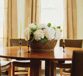
As I have mentioned before, I love how the previous owner installed beautiful mirrored French doors which reflect the light and the room's furnishings. Like many others, I really love hotel silver as it has clean simple lines and a more casual feel than silver. I used a small oval tureen for my paperwhite bulbs which worked well with my narrow French farm table. While I love the look of this table, it is very limiting when it comes to centerpieces and serving food. Since the table is long, I added two small coffee pots for some color and interest. The terra cotta tapers are from Creative Candles. creativecandles.com

While many people like patterned china and different colored glassware, I can't seem to get away from my classic cream plates and hand blown glasses. For this setting, I used Edme plates by Wedgewood. The wine and water glasses are Heartland by Simon Pearce. simonpearce.com While Simon Pearce glass is rather expensive, the Simon Pearce stores sell seconds at a reduced price. Once or twice a year they mark these down 60% off the original price, which makes them much more affordable. The cotton "chili' napkins are from Crate and Barrel crateandbarrel.com and the silver is Chantilly by Gorham. I used my collection of different antique silver plated napkin rings for the napkins. The turkey feathers and the artichokes are additional accents.

Since I was tired of making trips to the store, as I am sure you can all relate, I decided to search in my backyard for some greens for the small hotel silver coffee pots. I gathered some deep orange rose hips and boxwood, and then I decided to add a few small feathers. This small arrangement seemed to work just perfectly for the casual look I was trying to achieve.
Now that I am finally done with this post, I am going to spend the rest of this long weekend with our three daughters who are visiting from out of town. Two are in college and one lives in New York City. Thanksgiving is my favorite holiday as it is relaxing and provides four days to spend with all of our girls. Since they live in different cities with busy lives, we cherish our time together.
I wish you all a wonderful Thanksgiving.